Plotting
Roseau Load Flow provides plotting functionality in the rlf.plotting module.
Plotting Networks
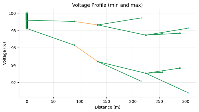
Voltage Profile
The voltage_profile() function can be used to create a voltage profile of the network.
A voltage profile represents the voltage (in %) of network nodes as a function of their distance from a reference node. Branches connecting nodes (buses) are shown as lines between bus locations. Buses are color-coded according to their voltages, while branches are colored based on their loading as described in the Results Colors section below.
The network must have nominal voltages defined for its buses and valid load flow results.
For multiphase networks, the voltage profile must be selected for a specific mode: either "min" or "max", which
represent the minimum or maximum voltage magnitude across all phases at each bus.
To visualize the voltage profile of a network, use one of the plot_<backend> methods on the object returned by the
voltage_profile() function. Example:
>>> import roseau.load_flow as rlf
... en = rlf.ElectricalNetwork.from_catalogue("LVFeeder36360", "Winter")
... en
<ElectricalNetwork: 9 buses, 7 lines, 1 transformer, 0 switches, 14 loads, 1 source, 1 ground, 2 potential refs, 1 ground connection>

>>> en.solve_load_flow()
(3, 4.206412995699793e-12)

>>> rlf.plotting.voltage_profile(
...     en, mode="min", traverse_transformers=True, distance_unit="m"
... ).plot_plotly().show()
Features
Reference bus: select the reference bus for distance; defaults to the source bus with the highest voltage
Transformer traversal: plot the entire network by traversing transformers; defaults to plotting the subnetwork connected to the reference bus only
Distance unit: choose the distance display unit; defaults to kilometers (
"km")Switch length: set a custom length for switches; defaults to 2 m or the shortest line length if smaller.
Supported Backends
Matplotlib: use the
plot_matplotlibmethod to create a static plot using thematplotliblibrary. You can optionally pass anAxesobject to the method to customize the plot further.Plotly: use the
plot_plotlymethod to create an interactive plot using theplotlylibrary.
Tip
You can plot both minimum and maximum voltage profiles on the same plot by passing the same Axes object to the
plot_matplotlib method for both modes. Example:
>>> import matplotlib.pyplot as plt
... import roseau.load_flow as rlf
... en = rlf.ElectricalNetwork.from_catalogue("LVFeeder36360", "Winter")
... en.solve_load_flow()
... ax = plt.figure(figsize=(8, 4)).gca()
... rlf.plotting.voltage_profile(
...     en, mode="min", traverse_transformers=True, distance_unit="m"
... ).plot_matplotlib(ax=ax)
... rlf.plotting.voltage_profile(
...     en, mode="max", traverse_transformers=True, distance_unit="m"
... ).plot_matplotlib(ax=ax)
... ax.set_title("Voltage Profile (min and max)")
... ax.set_ylabel("Voltage (%)")
... plt.show()
Interactive Map
The simplest way to visualize an electrical network with bus and line geometries is to plot it on a map using the
plot_interactive_map() function. Example:
>>> import roseau.load_flow as rlf
... en = rlf.ElectricalNetwork.from_catalogue(name="MVFeeder210", load_point_name="Winter")
... rlf.plotting.plot_interactive_map(en)
Make sure you have folium installed in your Python environment
and that your network has a coordinate reference system (CRS) set via the en.crs attribute.
Features
Interactive map: zoom in/out, pan, hover or click on elements to see their properties
Base maps: all folium tilesets are supported
Search: search for specific elements by their ID
Line laying: underground cables are dashed, other lines are solid
Voltage levels: HV/MV/LV elements have different sizes for easier identification
Layer control: toggle visibility of buses, lines, transformers
Custom styling: customize colors, sizes, and styles of elements based on their properties.
Use the map_kws keyword to pass additional arguments to the folium.Map constructor. Refer to the function’s
documentation for more details.
Note
Only buses, lines and transformers are currently plotted.
Interactive Map with Load Flow Results
The plot_results_interactive_map() function can be used to plot load flow results on
the map. The network must have valid results before calling this function. Example:
>>> import roseau.load_flow as rlf
... en = rlf.ElectricalNetwork.from_catalogue(name="MVFeeder210", load_point_name="Winter")
... # Let's create some extreme conditions to see  voltage drops/rises and line overloads
... en.loads["MVLV14633_consumption"].powers = 3.5e6
... en.loads["MVLV15838_production"].powers = -5.5e6
... en.solve_load_flow()
... rlf.plotting.plot_results_interactive_map(en)
The plot shows the buses color-coded according to their voltages and the lines/transformers color-coded according to their loading as described in the Results Colors section below.
Graph Plot
If a network does not have geometries nor nominal voltages defined, the plotting functions mentioned above will not
work. In this case, you can have a visual representation of the network by converting it to a networkx graph using the
to_graph() method and plotting it using the networkx library. In the
following example we plot the graph of the network MVFeeder210 from the previous example:
>>> import networkx as nx
... import roseau.load_flow as rlf
... en = rlf.ElectricalNetwork.from_catalogue(name="MVFeeder210", load_point_name="Winter")
... for bus in en.buses.values():
...     bus.geometry = None  # Pretend buses don't have geometries
... G = en.to_graph()
... nx.draw(G, node_size=50)  # This works even if the geometries are not defined
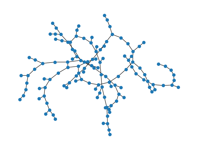
See the networkx docs for more information.
Plotting Elements
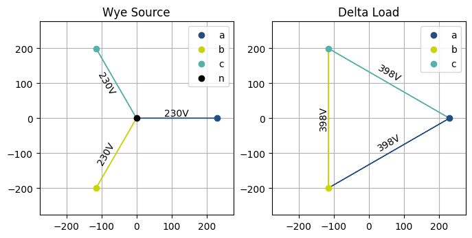
Voltage Phasors
The plot_voltage_phasors() function plots the voltage phasors of a terminal element
(bus, load, source or a branch side) in the complex plane. This function can be used to visualize voltage unbalance in
multi-phase systems for instance. It takes the element and an optional matplotlib Axes object to use for the plot.
Note that the element must have load flow results to plot the voltage phasors.
>>> import matplotlib.pyplot as plt
... import roseau.load_flow as rlf
... from roseau.load_flow.plotting import plot_voltage_phasors

>>> bus = rlf.Bus("Bus", phases="abcn")
... source = rlf.VoltageSource("Wye Source", bus, voltages=230, phases="abcn")
... load = rlf.ImpedanceLoad("Delta Load", bus, impedances=50, phases="abc")
... rlf.PotentialRef("PRef", element=bus)
... en = rlf.ElectricalNetwork.from_element(bus)
... en.solve_load_flow()

>>> fig, axes = plt.subplots(1, 2, figsize=(8, 4))
... plot_voltage_phasors(source, ax=axes[0])
... plot_voltage_phasors(load, ax=axes[1])
... plt.show()
Symmetrical Voltages
A similar function plot_symmetrical_voltages() plots the symmetrical components of the
voltage phasors of a three-phase terminal element.
Results Colors
The results in plots are color-coded based on the following predefined states:
very-low (blue): bus voltage below \(U_{min}\)
low (light blue): bus voltage in the first quadrant of the \((U_{min}, U_{n})\) range
normal (green): bus voltage in the last three quadrants of the \((U_{min}, U_{n})\) range or in the first three quadrants of the \((U_{n}, U_{max})\) range; line or transformer loading below 75% \(load_{max}\)
high (orange): bus voltage in the last quadrant of the \((U_{n}, U_{max})\) range; line or transformer loading between 75% and 100% \(load_{max}\)
very-high (red): bus voltage above \(U_{max}\); line or transformer loading above 100% \(load_{max}\)
unknown (gray): bus nominal voltage or limits not defined; line ampacity not defined
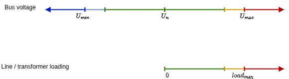
Colors are currently not customizable. Let us know if you need this feature.